


Photo Print Colour Accuracy
Screens emit light; paper reflects it — here is why colours shift and how to get closer to what you expect.
Upload with PreviewQuick answer: Phone and laptop screens often look brighter and more saturated than printed photos. Calibrate expectations by avoiding max brightness, use sRGB exports from editors, and choose 12-colour HD when wedding saree reds and skin tones must stay accurate.
Colour mismatch is normal — not a defect — because RGB screens and CMYK/extended-gamut printers use different colour spaces. Indian wedding photography especially stresses reds, golds, and skin tones that cheap lab prints clip. PrintPosters standard CMYK suits everyday snapshots; 12-colour HD expands gamut toward Pantone shades for professional portraits. Before ordering hero prints, slightly reduce contrast if your screen is set to vivid mode. Our online adjust tools help, but they cannot fully replace a calibrated monitor — preview on multiple devices if possible.
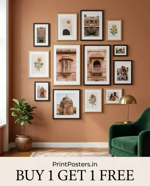
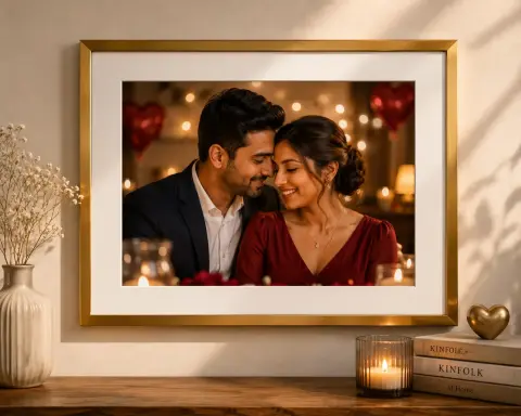
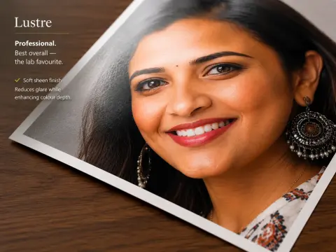
Examples for this guide


When to upgrade colour processing
| Scenario | Recommendation |
|---|---|
| Family 4×6 albums | Standard CMYK |
| Wedding portraits & sarees | 12-colour HD |
| Black & white fine art | Matte + standard |
| Vibrant travel landscapes | Glossy + standard or HD |
Frequently Asked Questions
Will print match my phone exactly?
Not pixel-perfect — but lustre paper and HD processing get closer for skin tones and rich colours.
What is 12-colour HD printing?
Extended ink set beyond standard CMYK for smoother gradients and wider colour gamut — ideal for weddings and professional photos.
Should I edit before upload?
Light brightness/contrast tweaks are fine; heavy filters may print differently — use our preview.

 Continue with Google