


Matte Professional Photo Prints
Portfolio exhibitions, architecture photography, and office art — matte professional prints without glare.
Upload & OrderQuick answer: Matte professional prints suit portfolios, architecture photography, and office art walls where glare from lights would distract.
Architects, fine-art photographers, and designers prefer matte for controlled viewing — especially under gallery track lighting or office LEDs. Text overlays and signed prints show cleanly without shine hotspots. When printing CMYK-heavy infographics or typography on photo paper, matte preserves readability. Upgrade file resolution for A3 portfolio sheets; matte hides minor gloss artifacts but not blur.
Photo print examples for this topic


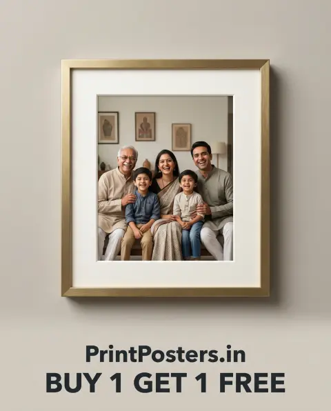
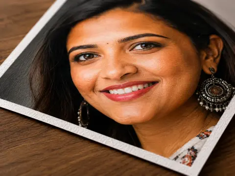
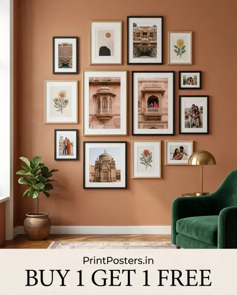
Best use cases for this combo
- Architecture portfolio exhibition sheets
- Fine-art black-and-white series
- Office lobby art rotation prints
- Design agency project showcase boards
Frequently Asked Questions
Matte vs lustre for corporate headshots?
Matte for office walls; lustre if warmth and skin tone richness matter more.
Signed matte prints for artists?
Yes — matte accepts ink signatures without smear when fully dry.

 Continue with Google